Do Modern Responsive Websites benefits Google ranking?


Responsive web design is a specialized approach to design a website in which the web-pages adapt to various browsers, resolutions, or devices and fall into suitable layout without requiring any customization. A responsive website provides a superior browsing experience in a wide array of devices without requiring much panning, scrolling or adjusting the layout.

You might have heard that SEO is an effective way to grow business and if you do not have a responsive website design; your website is not search engine friendly. Is it true? In this article, we will found the truth of responsive web designing role in SEO. Let us first find why people say that responsive website is good for SEO.
Why responsive design is getting attention?
The king of search engines, Google not only recommends responsive web designs as the best way to target mobile users, but also favors mobile-optimized websites when presenting results for searches made on a mobile device. Some benefits that are making responsive website design popular for SEO are as follows:
1. One Website, One URL
Responsive websites use one URL and one set of pages and files, which make it simpler for Google to crawl and index the content of website. Mobile responsive web design works on screens of all sizes, on a wide variety of devices. This feature assures that users get the same consistent web experience when they visit your website, no matter what kind of device they are using. Since Google is now taking into account user experience when they rank websites, it plays a major part in increasing your website’s standing with the search engine.
2. Responsive design helps Combat a High Bounce Rate
Even if a site is sitting high in search results, if it doesn’t work effectively for mobile and tablet users, these websites may suffer from high bounce rate. Google will interpret this high bounce rate of website as a sign that it is not providing relevant or quality content to the users, which is likely to lead to a drop in rankings. A responsively designed site combats this problem by presenting the same content found on the desktop site to other devices.
3. Reduces Page Load Speed
A responsive design of website does not require queries to redirect users to a different URL (the mobi version of the page), thus, responsive design significantly reduces the load time of the webpage. Page loading time is one of the important aspects that Google uses while ranking a page, because of the impact of loading time on the user experience – and what is good for user experience is good for rankings.
4. Improves Mobile Search Rankings
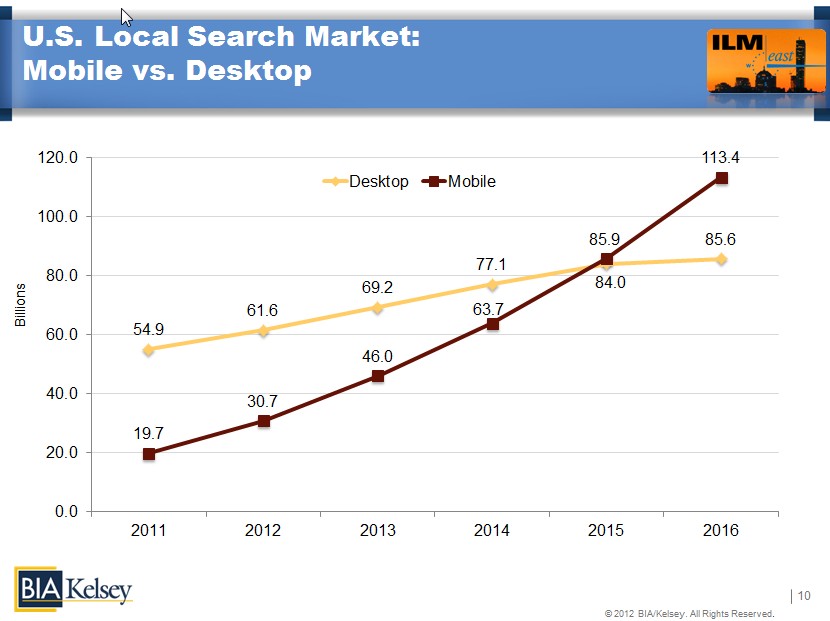
According to BIA/Kelsey analysis, mobile search is set to overtake desktop search queries in 2015. Therefore, it is a good idea to get a head start on your competition to be in mobile search by implementing a responsive site now.
Switching to responsive design will help you rank better in mobile (and possibly desktop) search, as you provide your visitor with the best user experience for their preferred device.
Are these responsive design advantages are enough to decide Google ranking?
After reading these benefits of responsive web design, you may be thinking that for smartphone websites, amalgamation of effective website designing ideas and responsive web structure is the best way to make Google happy. But, it is not. Let me explain why?
Google’s webmaster trends analyst, John Mueller posted in a Stack Exchange thread that mere responsive design doesn’t give any website a ranking boost. In addition to responsive website design, Google consider common ‘configuration errors’ to adjust the rankings in smartphone search results. Google also demote ‘non-mobile friendly smartphone websites’ from ranking so well on mobile. Non-mobile friendly smartphone websites are those websites which shows common configuration errors like faulty redirects, unplayable videos, smartphone-only 404s, app download interstitials, irrelevant cross-linking, and page speed. Let us understand these mistakes:
1. Faulty redirects
There are many websites that have dedicated smartphone-optimized web pages and redirect smartphone users based on the user-agent i.e. desktop, smartphone or tablet. In faulty redirects error, a user is redirected to an irrelevant URL on the smartphone site when he is trying to access URL on the desktop site.
2. Unplayable videos
If yourresponsive website has many unplayable videos, it can affect your search engine ranking. This can occur due to licensing constraints or due to requiring software or device capabilities that smartphones do not support. It is recommended to use HTML5 standard tags to include videos and you should avoid content in formats, such as Flash, that do not support all mobile devices. You can also consider having the transcript of video available on all devices so as to better serve your smartphone users.
3. Smartphone-only 404s
There aresome websites that serve good content to desktop users accessing a URL, but show an error page to the smartphone or tablet users. Therefore, in order to save your site from Google penalties, you should keep in mind following points:
- Try to make a smartphone-friendly page at a different URL, and redirect your visitor to that URL instead of serving a 404 or a soft 404 page.
- Make sure that your smartphone-friendly page itself is not an error page and if your content is not available in smartphone-friendly format, you should serve the desktop page instead.
4. App download interstitials
There are many webmasters, who promote their website’s apps to their web visitors. There are many implementations to do this; some implementation may cause indexing issues of smartphone-optimized content and some may be too disruptive to the visitor’s usage of the website.
5. Irrelevant cross-linking
If your smartphone friendly URL has links to the desktop-optimized version and likewise a link from the desktop page to the smartphone page, it may invite penalty from Google algorithm. Therefore, you should make sure that the links point to the correct equivalent page.
6. Page speed
Optimizing a responsive webpage’s loading time on smartphones is quite important given the characteristics of mobile data networks smartphones are connected to.
These are some important configuration errors committing which might affect Google ranking. Therefore, only responsive web design is not enough to rank high on search engine result page. In addition to this, you have to avoid these configuration errors and provide superior quality content to make Google happy. Furthermore, simple and user friendly web design is equally important to gain maximum satisfaction of the visitors; therefore, professional and experienced web designers definitely help you to turn visitors in to customers.
Sandeep Sharma is a creative head at India-Designers.net. He has more than 15 years experience in the web designing domain. He is leading the team of more than 25 web designers in the company. All Web Design Projects of the company start and finish with him. You can follow him on Twitter and Google Plus.