Mobile Site or Responsive Design: Which Is Better?


Back in the day, website development was much easier than it is today. In those days, developers only had to account for desktops and laptops, and marketers did not even know what mobile SEO meant. Today, technology has evolved to support on-the-go users who need information in real-time. And to receive that information, they need websites that are fluid, interactive, and work across all devices. The question is, mobile or responsive?
Success in today’s marketplace is largely dependent on how user-friendly your website is. Actually, in a world where everyone’s moving and practically everyone has a smartphone, success really depends on how mobile-friendly your website is. Exemplifying this, Google, the world’s favorite search engine, announced last year that they would start making their index mobile-first:
Today, most people are searching on Google using a mobile device. However, our ranking systems still typically look at the desktop version of a page’s content to evaluate its relevance to the user. This can cause issues when the mobile page has less content than the desktop page because our algorithms are not evaluating the actual page that is seen by a mobile searcher.
For those who do not know what this is, it basically means that they are going to use the mobile version of a website for ranking purposes. Because of this, one, you now have to appeal to the majority of online users: mobile users, and two, you have to adapt to the changing times and learn how to deal with the mobile-first index.
The first thing in your list should be getting a mobile-friendly site. Not just mobile-friendly though, go for an actual mobile or responsive site. The thing is, mobile-friendly is the bare minimum to pass Google’s tests and will do very little to help your site’s user experience (UX). Instead, you need a site that works smoothly on all devices to create a seamless experience that will keep everyone logged in.
And now we arrive at the crux of the matter, choosing between a mobile or responsive site.
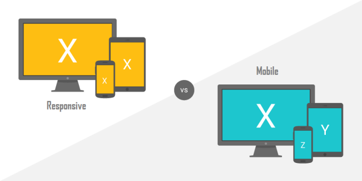
Mobile Sites

Before responsive sites, their predecessor were: mobile sites. As you can gather from their name, mobile sites are just websites which are developed specifically for mobile devices. And because they are designed and coded specifically for mobile devices, they are pretty good at showing off content the way mobile users want to consume it.
Think of mobile sites as light versions of their desktop counterparts. They are completely separate from the main site and have unique URLs that usually start with “m.” For example, if the main site is “example.com”, the mobile site is “m.example.com.” More often than not, they are also paired with a minimalistic design, have fewer pages, and often have fewer features that do not exactly work well on mobile devices (e.g., large images or downloads). That is not to say that they can not be exact copies of the main site (content-wise), but that depends on the developer’s level of expertise.
Responsive Design
Out of mobile sites sprouted responsive sites, websites developed with a responsive web design (RWD). From the very beginning, way back when the developer starts coding them, responsive websites are designed to display content properly on all devices, whether they vary by browser or screen size. Think of a responsive design as a love all, serve all design that exemplifies ‘one size fits all’ with its scaling abilities.
In the back end, the server essentially sends the same content to all devices accessing it and includes information that tells the mobile devices how to best display content specific to that particular screen size (i.e., images, text and everything else are resized for an optimal fit). Keep in mind that it is not just about screen sizes, it is an entirely new way of looking at the design that responds to the user’s environment and behavior. It is a design that uses CSS media intelligently with a combination of flexible layouts and images, and fluid grids based on proportion.
The goal is for the website to adjust automatically to accommodate its users. So if you’re browsing online and switch from a laptop to a tablet or from a desktop to a mobile phone, the site automatically adapts to adjust scripting abilities, size and resolution. Therefore, all content can resize, hide and move around to look best on the screen it resides in (this includes adjusting for orientation — landscape and portrait).

Mobile or Responsive: The Debate
Now that we have an understanding of what mobile sites and responsive sites are, it is time for the debate to begin and consider the pros and cons of each.
Mobile Site Pros
The biggest benefit you will gain from opting for a mobile site comes from UX. Like we covered earlier, mobile sites are developed specifically for mobile devices. As such, they are optimized for mobile devices and mobile devices only and provide a completely unique experience for users who are on-the-go. They are cheaper to develop when compared to responsive sites, have very fast loading times and because they are slimmed down versions of desktop sites, are quite easy to use.
Mobile Site Cons
The majority of the downsides associated with mobile sites stem is one of their primary characteristics, that they possess an entirely different domain than the main site. For starters, you now have two websites to maintain as opposed to each other. So if there was an update that needs to be made, the changes have to be rolled out on both sites. And because they are coded to work on existing phones, tablets, browsers, etc., they may not be entirely compatible with next-gen devices.
More importantly, when someone tries to access the website through a mobile device without explicitly entering the mobile address, a redirect takes place that takes them to the mobile site. When this happens, extra loading time is added, increasing the site’s bounce rate. And as many marketers and webmasters know, redirects are widely considered to be ‘conversion killers’. One more thing on redirects, Google greatly dislikes them.
Responsive Design Pros
Due to their characteristic of essentially being the same website across devices, responsive sites only need one domain (the difference comes from the way code is executed in the back end). They are much easier to manage than mobile sites, both from a development (maintaining and updating one site is easier than two) and marketing (SEO campaigns) perspective, and are cheaper to maintain as well.
Overall, responsive sites also have a higher chance of achieving low bounce rates because they are suitable for all devices. And unlike mobile sites, they work on current and future devices without additional code changes. One last thing, as you can see from Google’s very own website, they actually recommend responsive designs:
Responsive web design: Serves the same HTML code on the same URL regardless of the users’ device (desktop, tablet, mobile, non-visual browser), but can render the display differently (i.e., “respond”) based on the screen size.
Responsive design is Google’s recommended design pattern.
Responsive Design Cons
Unfortunately, responsive websites are much more expensive to develop than mobile sites (keep in mind that this is not true if you are developing both a mobile and desktop site, as this will increase the overall cost above that of a single responsive site). It is also more time consuming to develop and, if they are not designed well, will hinder UX. There may also be a sacrifice in functionality due to the compromise between choosing to uphold an experience over another. Additionally, users who prefer older versions of Internet Explorer will face compatibility issues.
Final Thoughts
Mobile sites may work best for some, while responsive sites work better for others. It all depends on your business, your industry, and your users. Whether you choose one over the other, choose between them. Do not stick with a mobile-friendly site and definitely don’t stick with a single desktop site. Do the right thing for your business and your users and opt for a mobile or responsive site. Once you do, make sure to optimize it for mobile search as well.