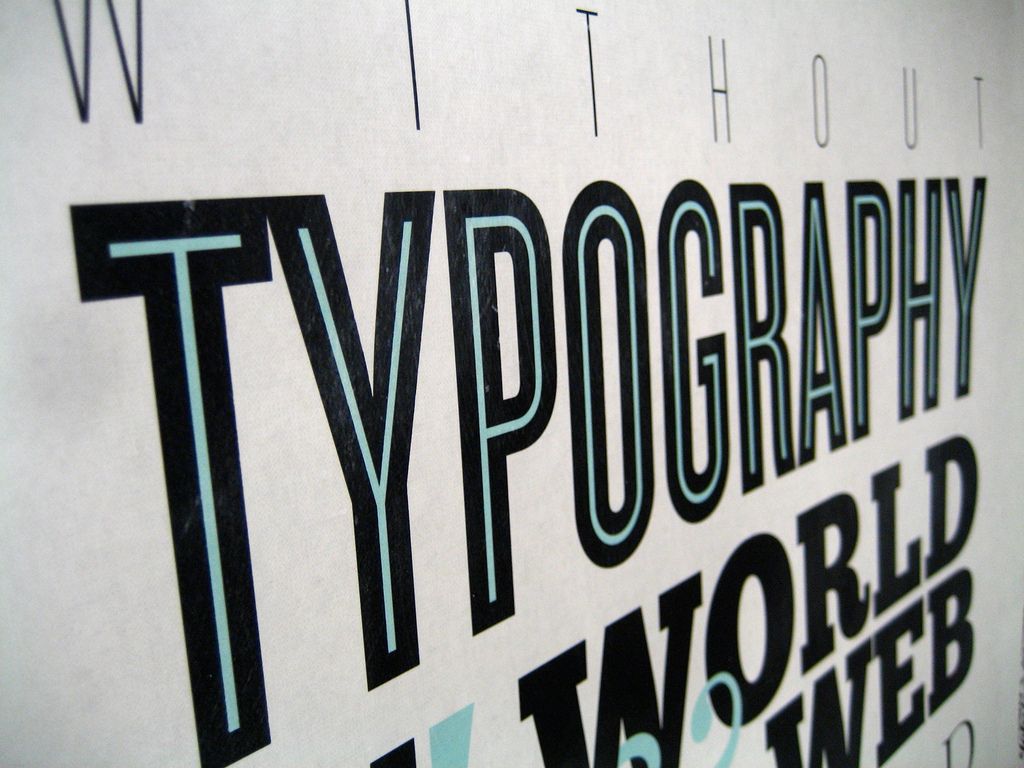
The importance of web typography in enhancing website designs

The graphic designer takes a lot of interest in exploring the powers of typography in web design. The ways types display and the message it carries create interesting design elements that facilitate closer viewer engagement. Considering the underlying message of the typeface and finding a way of expressing it and communicating it to the audience involves walking the fine line between verbal language and visual language. It is often difficult to perceive which comes first – the text itself or the visual effect that it creates although on some occasions the latter dominates. With responsive design becoming the most accepted method of web design, its success largely depends on the visual effects created by the typefaces.
In practice, there exists a close relationship between the word viewed as a message and the manner of its transmission in visual form. According to the SEO experts in Boston, the visual appearance of the typeface and the text creates a message that goes much beyond the literal meaning of the text. The significance of the overall typographic effect and its characteristics generate a visual language that augments the verbal language. The text of a page sets up the communication, and the typography helps to drive the message home. Why you need to take special care of typography in graphic design is the topic of discussion of this article.
Conveying a message
The kind of design elements would be suitable for the website depends on what message you want to convey to viewers. Carefully understand the message that influences the design scheme. The power of typography is such that you can choose selectively to convey the emotions underlying the message. From the style to the size and the color of the typeface to the graphics, think about everything very well so that it perfectly echoes the unheard message that lies beneath the typeface. The typography you choose for conveying hope and confidence linked to some fundraising event of an NGO will be entirely different from what you would use for expressing the aggressiveness, fun, and excitement of a sporting event. What you want to convey regarding the literal meaning together with the underlying emotions and sentiments determine what kind of typography would be suitable.
Setting the tone of textual content
You need to set a specific tone for communicating the message, and the typeface helps you to achieve the goal. When viewers look at the content, the appearance of the typeface sets the tone of the communication that they can sense. By looking at the typeface, its style, and color, viewers can sense what to expect from the communication. Selection of the typeface is thus crucial in setting the right tone that sets the stage for effective communication with a specific purpose. When viewers set certain expectations as prompted by the chosen typefaces, it becomes easy for designers to make them accept the message in the way intended. The tone set by the typeface will prevail throughout the content and reinforce the message. Consistently maintaining the tone throughout the design is the task of the designer.
Influence the first impression
What kind of the first impression that viewers carry with them depends on the selection of the typography that helps to create the impression that corresponds to the tone and tenor of the message it conveys. When looking at a page created for serious reading by professionals, it should become clear from the typography that the content needs serious attention. Similarly, a page directed at young musicians should immediately make viewers get a feel of the exuberance and creativity of the composers. Therefore, understanding the audience becomes very important for designers to think about the appropriate design features that elicit the right response.
Follow the hierarchy in design
It is common to have a hierarchy of design for any website but what is important is to provide a map to viewers so that they know where to start reading and navigate through the site. The typography provides the map. By using varying typefaces and changing its sizes, you can direct viewers to the most important messages and portions of the website that demands closer attention. Proper selection of typography enables better communication of message than any other design elements.

Size and placement
By choosing the right size of typefaces and its proper placement, you can balance the design well. For creating a great website design, you should know where to place the text and what would be the appropriate size. By combining large and small texts, you should stretch the design elements to suit your communication needs while maintaining proper balance in the design. Creating the right text sizes is an exercise in experience and skill that designers have to acquire.
Moreover, typography can add mood and context to the content to generates user interest.