Designing Your E-commerce Site for The Future: 8 Trends to Watch Out

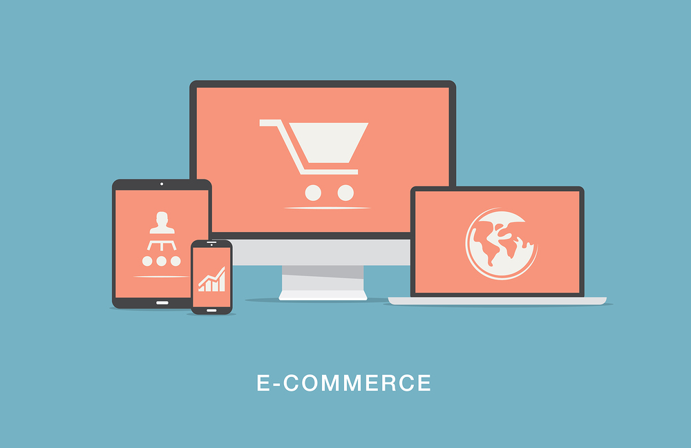
While the competition among e-commerce websites is reaching an all time high level, the user-friendly design has a great bearing on the customer engagement and business output. When most e-commerce sites look appealing, you do not have any other way but to beat the competition with more intuitive and user centric design. For e-commerce sites, it is extremely important to stay equipped for the future trends.
Is your e-commerce website design already looking backdated and less sophisticated in comparison to the latest trends? If you are going to redesign your website consider the following design trends that are supposed to rule the e-commerce web design in the time to come.
1. Material Design
After the domination of flat design for years in a row, Material Design took over the baton adding more depth to the simplicity and ease of use characteristic of flat design. The material design allows more depth to the flat coloured surfaces with subtle gradients and shadows is continuing to remain popular as a design principle, and e-commerce websites are not going to be left outside of the spell of this design trend.
As of now, most experts predict that material design is there to stay as it brings together the best of flat as well as skeuomorphic design. While the flat design has always remained popular for its simplicity, ease of use and accessibility and readability of contents, the shadows and gradients added to the cool flat surface give the design a more material feel which is helpful to initiate interactions.
2. Conversational Bots and Chatbots
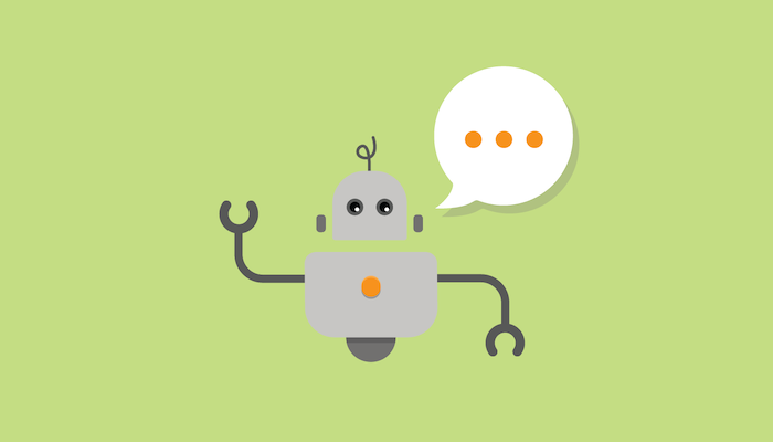
Bots are not just a fancy design trend; it represents a massive reality and no less than a paradigm shift for the web and e-commerce designers worldwide. With conversational bots, the shoppers now can have a more real life feel of shopping. These bots can intuitively understand your searches and on page actions and accordingly can recommend product options and choices or can just help you find something on the website. Conversational bots are like shopping guides who never leave customers in the middle of confused nowhere surrounded by products and features. For a more guided shopping experience, they are inevitable.
Chatbots on the other hand help customers stay engaged and interactive. With chatbots, an e-commerce website can answer all kinds of customer queries about the products, features and website services and can also make recommendations and offers based on the user reactions and activities. By utilising Chatbots, you ensure making the shopping experience more interactive and guided.
3. Hidden Menus
It must be several years since we began seeing hamburger menu almost everywhere on the mobile web and apps. Yes, hamburger menu as a smart option for hiding all the navigation menu buttons made web design for small screen real estate of mobile devices simple. While clearing visual clutter has always been a priority for most designers, the popularity of such smart menu is well understood. But now this hamburger menu just evolved into a new avatar, and this time we come across completely hidden menus.
Yes, hidden menus is now an established navigation design convention which is supposed to become more popular in the time to come. It is more than two years since hidden menus are being used by many e-commerce websites and it is continuing to be popular for clearing visual clutter by hiding the entire cluster of menu buttons from the visibility. Hidden menus are normally accessed by swiping the screen, or some websites make the menu appear contextually only when the user needs it.
4. Dynamic Search
While offering a search function to access the desired products is something irreplaceable for any e-commerce website, there have been many experiments to make this search function better and richer. Dynamic Search, a recent and eye-popping trend for many e-commerce website owners can just help you cater products in response to the user search in a dynamic and highly user-centric way. It is particularly successful when the e-commerce site has too many products to display.
5. Long Scroll
Every one of us has personal experience of scrolling down the news feed on our Facebook page by continuously scrolling down for minutes on end. This long scrolling of contents is something that typically suits the mobile screen and mobile audience. Mobile users are particularly habituated to scroll down the page continuously whether in search of their preferred items or just as a casual action to browse until it reaches very bottom.
Such long scrolling coupled up with storytelling visuals and accompanying texts can create a fuller impression. This is particularly useful for single page websites, though you can always use a long scroll with multiple page websites for creating depth with each segment.
6. Minimum or No Text in Hero Image
Full blown hero image with a flagship product taking the center stage is already an established trend for many e-commerce home pages. But such simple and robust design become even more intriguing when no text accompanies the hero image. A website featuring only a few category of products can just offer a large hero image with representative products for each segment shown side by side. The images appearing without any text can intuitively tell customers where to click for their respective needs or choices.
7. Rich Animation and Cinemagraphs
Whether in retail websites or mobile commerce sites, everywhere we see continued insistence on playable and interactive elements. For making e-commerce web experience playable and interactive, there is no better way than incorporating animation into the web design. By utilising at the right point of time and in right contexts, they not only add value to the shopping and browsing experience, but they also create a lighter mood for the customers to remain engaged.
Just like animation, GIFs or Cinemagraphs are continuing to be popular in e-commerce design as they are more appealing and eye catchy while always delivering the message intuitively to the customers. These GIFs or Cinemagraphs can be utilised as images of various display items, banners in landing pages, header images, etc.
8. Large and Beautiful Typography

While content continues to remain in the limelight across all websites including retail and e-commerce, typeface traditionally which is known as an element to enhance readability has now become an active ingredient of web design. Beautiful and full-bodied typeface will continue to remain a mainstay in the scheme of things for the web designers. In e-commerce sites, consistent use of a visually appealing typeface can help creating a brand identity.
The Bottom Line
Obviously, there are still a few other trends that we could not explain here. In overall consideration, the future of e-commerce websites will lean more towards stylish elements and ease of use. How better you can create your style without compromising the ease of use and accessibility, will be the most important determinant.