Basic about color combination in website design


The essay delves into the basic principles for combining colors in web design: what colors to use in context, how colors work together, and how best to use them.
Combining colors in a web design is like building a building, starting with a solid foundation, building the structure and ending with a beautiful painting. Let’s start with the basic principles.
1. Lay the groundwork: choose a background color
Choosing the background color for the site is very important, it is the foundation for any color combinations and has a great influence on the overall design. The background color represents your design, deciding the user’s first impression of the site. Make sure that the background color reflects the purpose and meaning of the website you want to display.
Black

Black usually makes one think of dark, evil or the devil, but it also represents the elegance, power, and strength. Black is a great background color as it contrasts with almost all colors, including bright colors. However, be careful when using too much black, which makes it harder to read and can cause eye pain if seen in a long time.
White

White represents cleanliness, purity, perfection and creates a feeling of more space. It also contrasts with most colors such as black, but not overwhelming that makes the eye easier to see. White is a great color to be the background color for websites related to religion because it represents the uprightness, purity or for sites about art and photography. If you want to look for a clean and clear design, use plenty of white.
Red

Red is a pretty strong color, like a wild flaming fire that attracts attention, so it is a great color when it comes to calling and persuading. Color is also related to energy, in which red is the most energetic color, attracting the attention of users who click on the ad or register the product.
Orange

Orange often makes people look happy. It is a tropical color associated with joy, charm, energy. Orange is a very friendly, inviting color, often quite effective with calls to action. Orange is also one of the colors with the highest display ratios, so the orange parts will appeal to the eye and highlight important elements of the design.
Yellow

Yellow is bright, light and cheerful. Yellow often gives people a sense of warmth, fun, it is also a great color contrast with the darker colors like black, gray. Yellow is a great color to highlight the important elements and attract the attention of the user. However too many yellows will make a feeling of instability, so if you were to do a website to create a sense of security, you should avoid using yellow.
Green

Green is the color of nature, often associated with development, peace, stability. The green background is great when you want to express the peace because it is the most eye-soothing colors. Because green is opposed to red, creating a sense of security, reliability, suitable for financial institutions and banks.
Blue

Blue bring stability and depth, it symbolizes confidence, sincerity, hope, understanding, and trust. Blue is usually preferred by men. However, it is not a good color to attract attention, as it does not stand out from the contrasting colors. Another interesting point is that blue reduces appetite, so do not use it for food websites.
2. Structural construction: Color combination
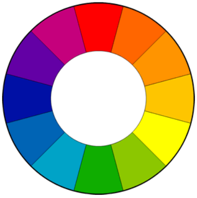
Color combinations are usually based on color cycle, there are many web pages or software to support creating. The most commonly used color combinations are:
- Monochromatic
- Complementary
- Triadic
- Tetradic
- Analogous
Monochromatic

This combination uses saturation of the same color, which sounds pretty boring? Not really. This combination is quite simple, which creates a sense of courtesy and elegance. However, it may look a bit tedious due to the lack of contrast. If you feel too tedious, try Analogous (which will be explained below), which can increase contrast and still create a feeling of simplicity.
Complementary

This combination is used when you want to create a strong contrast. Contrast colors are two opposite colors in the color cycle. This combination is used when you want to create a strong contrast. Contrast colors are two opposite colors in the color cycle. For example, your background color is blue, the color contrasting with it is red. For example, your background color is blue, the color contrasting with it is red. Contrasting colors are difficult to see if used too much, especially for writing, but extremely useful when highlighting something. Uniform colors or logos in sports often tend to use contrasting colors, which are also common in advertising.
Triadic

This is a combination of three colors lies at the vertices of an equilateral triangle on the color cycle. This approach retains the contrast but it is more harmonious than the contrasting color combination. However, you should only choose one main color and use more. If you want the vibrancy of color contrast but still want to keep the uniformity of monochromatic colors, this combination is for you.
Tetradic

This is a combination of four colors in which there are two pairs of contrasting colors, this way both brilliant and balanced and can create many variations. However, it is difficult to balance the hot color, cold color, so only use one color as the main.
Analogous
Similar colors are colors that lie next to each other in the cycle. Usually, they quite fit in with each other, create a feeling of softness, comfort. This combination is often found in nature, creating a pleasant feeling for the eyes. However. This combination does not create a high contrast, it only contrasts better than monochrome. The best way to use this approach is to use a dominant color, the second color to reinforce, the third color used with white, black, gray to adorn.
3. Tints, shades, and tones
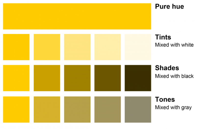
These three concepts are often misunderstood, although fairly easy to distinguish.
- Tints: Lighten the tone by adding white.
- Shade: darker by adding black
- Tones: More or less gray to create a feeling of cold or warm colors.