7 trends about color inspiration in Website Design in 2016
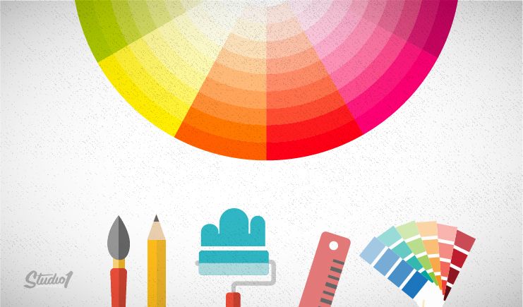
Color is a part of our life and it appeared a long time ago since the appearance of the sunlight. However, we have not had an exact definition for color. It can be said that, people is one of the luckiest species that can be aware of colors. Actually, people’ eyes can identify numerous colors and those colors is always changing based on the relationship between light and viewing angles. Color can affect people on many aspects and many areas.
Especially in Website design, color is a vital role which decides the aesthetics of the web, making inspiration to navigate visitors to a specific action. Moreover, it can help a business to create and develop their brand. Website is a highly intuitive vehicle of people’s communication. Website designers really understand the amazing power of color. This article will show you 7 trends about color inspiration in Website Design geared towards in 2016 which is useful for professional Web designing.
Bright and simple colors are being applied by a lot of Website Designers. in addition to using that kind of colors, you should also consider about the trends are mentioned below:
1. Monochromatic color
Simple colors and minimalist colors are the most popular choices nowadays. Therefore, it is also a basis for a lot of Website Designers choosing for their designs. Website designing basing on monochromatic color use many different shades of a same color. This style can be applied for bright colors.
With advantage is less distracting and the contrast of the color is low, website designers can optionally test various colors to choose the most appropriate and creative colors.
2. Contrast with dull colors
There are many designers are afraid that using monochromatic color can cause boredom and jejuneness for their website designs. It is time for contrast trend become more effective.
3. Blocking and hovering
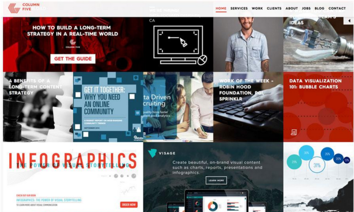
The blocking trend and hovering trend are very well-known and used by not only theirs eye-catching appearances but also their usability, especially for websites with card-style interfaces. Blocking is a grid-based layout in which blocks and cards are distinguishable from each other by many impressive colors. Hovering is refer to elements of a website (especially cards) will automatically change color when you hover over the top.
You can use Blocking and Hovering separately. However, both methods actually are combined together to create a stronger impression for your website.
4. Texture
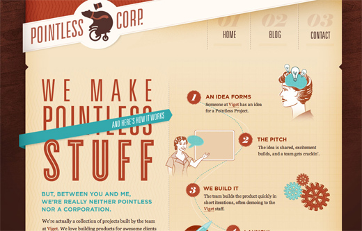
Texture can still be combined with bright colors and bring outstanding results though texture is often used for neutral backgrounds.
5. Highlighting text
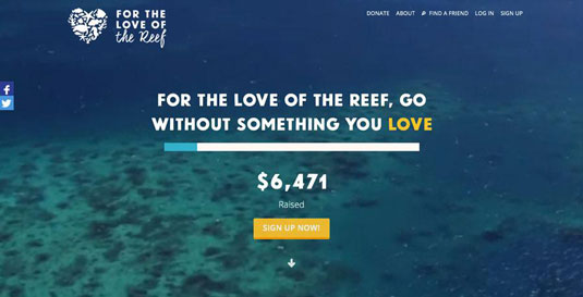
Bright colors are often used for highlighting some letters in a text block, especially when they are applied for darker backgrounds. The brilliant colors of the letters can emphasize and affect the transmission of the message.
6. Buttons/UI elements
Like text, bright colors can be used to highlight buttons in website or other user interface elements (UI elements) in order to draw users’ attention.
The colors of buttons can affect the level of users’ interaction with website as well as the level of users’ attracting.
7. Navigational aids
Heretofore and until now, we often use method of marking books and records by brilliant and striking colors on the main points which needs to be noted to make it easier to search for. Therefore, applying it to navigate your website is a reasonable solution. Using colors to divide and mark the important contents will help users approach information in your website more easily.
In a nut shell, in order to have nice web interface designs, you need to understand, manipulate and combine different colors effectively. Moreover, website designers also need to have your own strategies for the goal that you want to bring viewers. Therefore, website designers need to have aesthetic eyes and always implement new knowledge in website design trends around the world.
Colors play a key role for life in general and website designing in particular. If you want to create a website successfully, let’s play with colors, experiment with different shades and choose the best representative color for the nature of your company to your customers.


