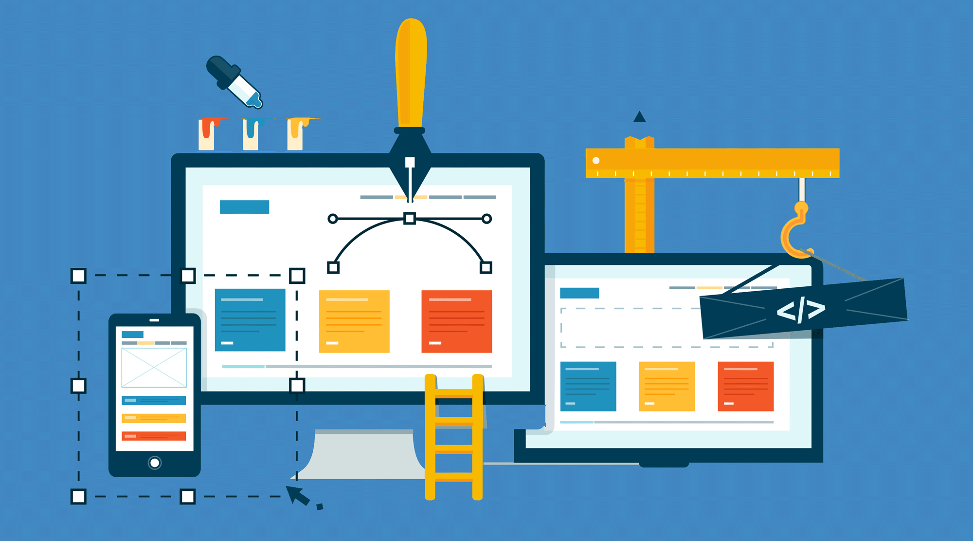
5 Invaluable Tips to Design a User-Friendly Website


We are aware of the rise of the mobile web and we are aware of the huge change mobile brought to the look, feel and usability of websites. With the vast majority of browsers searching the web and accessing websites on their handheld devices, either you need to make your website user-friendly on mobile devices, or you compromise with the flow of traffic.
Apart from this consideration about mobile browsing, you need to give priority to customization, minimum user input for performing actions, quick readability, eye candy and attention-grabbing design, smooth contextual navigation and much more. Let us explain here six invaluable tips to design a user-friendly website that any website development company needs to follow.
1. Make navigation obvious
Navigation is the quintessential area where most good website design excels while bad web design features a poor show. To nail what takes a good navigation for a website let us begin with the common mistakes.
- Your navigation menu cannot easily be found. It is an unpardonable mistake and will be punished by good bounce rate. Your menu should be instantly visible.
- A menu with buttons that are too small for finger tapping will only make it harder for mobile users to click.
- A menu not optimized with proper contrast in color is a strict no-no. Such menu just fails to get any traction or is just overlooked.
- Too many layers of the menu is another common mistake. Too many sub menus will ultimately lead to confusion or make it harder to decide for users.
- The absence of any search function is another mistake adding difficulty to find the intended thing.
Now let us come to the positive side concerning menu. First of all, for mobile, the hamburger menu has almost become a smart tool to hide the menu to save screen real estate while allowing quick access just with a tap. For desktop hovering effect for the menu will add more ease. The last piece of advice would be limit the number of menu buttons as users have less patience to go over the entire list of menu and submenus.
2. Loading time

Now it has become common knowledge that Google simply does not like considering slow websites for search ranks. Yes, loading time beside undermining the user experience and increasing the bounce rate can also pull your search rank potential down. How long a website takes to load does matter. Most browsers leave a site if it takes more than five seconds to load. With mobile browsers, the impatience is even more severe.
So, loading speed is something your web design undertaking should consider before anything else. As web pages these days tend to be heavier with media and image files, complex and multilayered layout and design, different types of effects and scrolling, maintaining loading speed tends to be a challenging thing. Let us offer some effective tips to optimize the loading speed.
- Use the right format of images that are lightweight for loading time.
- Compress the images in the right measure to boost loading time.
- Avoid using Flash for multimedia files and instead, use HTML5 or respective media plugin with the CMS.
- Allow no conflict of interest between two plugins pulling one another in the backdrop.
- Use a code compressor to boost loading speed.
- Write clean and neatly organized code.
- You can use latest techniques like Lazy Loading to boost loading time. Lazy loading ensures loading the immediate page elements while the others continue to load in the background and as the user scrolls down, they become accessible.
3. Above the fold and thumb-friendly design
We decided to mention two principles simultaneously here because of their close relation. One of them, ‘above the fold’ design is already an established principle, and it tells us to place all the navigation buttons and actionable links just above the fold in areas that catch the user attention first. It is important to showcase the phone number, contact information, and even social page links just on the top to grab quick attention and boost user actions with them. If user actions give leads and convert businesses, you need to give all the actionable stuff close to their eyes.
Thumb rule is the second design principle that evolved in the recent wake of mobile browsing. Most mobile users these days handle their device single-handedly while navigating with the thumb. So, anything that does not come within the circumference of thumb movement can get a miss. This is why from scrolling to buttons to clickable links, a mobile website needs to make them easy for thumb reach.
4. A design that breathes
Now let us unveil the popularity factor behind one of the biggest design trends of our time. Yes, you have guessed it right. We are talking about flat web design. A flat design became popular principally because it lived up to its promise of making readability more easier and engaging user attention for longer. Our mind easily gets distracted, especially with several design elements put together. But when elements are fewer in a clutter-free layout, our attention can easily rest.
A clean, clutter-free and minimalist design with a lot of white space will help to grab attention and engaging with contents.
5. Boost readability with structured contents
Look at the homepage contents of most service provider websites these days, and you will understand there is something underway that can be termed as the teaming up of contents with the design. Yes, many websites are providing contents based on the demand of the design. Users these days read less and scan more in their inpatient browsing moves. So, eye catchy design of these sites wants to accommodate the contents that are absolutely essential.
Not just homepage, but in every piece of web contents such principle stands out. In the case of blogs and articles, quick readability is an issue, and so contents tend to incorporate small paragraphs, bullet points, subheads, etc. To present informative contents in a neat visual manner, infographics are increasingly being popular.
In Summation
User friendliness or quality user experience is what every website strives to achieve. The above principles and web development and design strategies show that you need not sacrifice aesthetics to prioritize usability. Rather, when aesthetic principles are utilized in the right measure, your website actually will become user-friendly.