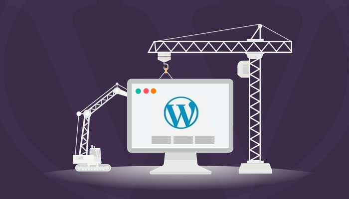
4 Easy Ways to Create a Professional Website with WordPress


If content is king, then design is the crown and the throne, scepter optional, that gives the king a regal authority and power.
Anyhow! What my point is, that to make your content accomplish its purpose, you need design to capture, hold, and guide your visitors’ attention. Even the most hilarious comedy prose is a useless piece of useless junk when displayed within a chaotic front end of a website. On the other hand, the lamest of cat videos are comedy gold when showcased properly.
Looks do matter. But if you think that getting a first-class premium WordPress theme solves all your problems, you’re sorely mistaken. 1.) You won’t stand out from the rest of millions of websites using the exact same theme, 2.) Even if you do, you’ll have to manage a lot of appearance settings yourself.
Here are a few tips to keep in mind if you’re aiming for an overall more professional look for your WordPress website:
1. Body Text
Key points – Readability, Legibility, oodles of white-space, and accessibility
While it may match your site’s / brand’s visual identity, giving in to the temptation of using archaic/ loopy/ too small or large fonts for body text and bright, clashing colors for its background is a mistake you’ll regret.
You want readers to READ your content, not be blindsided by it. Loopy, ornamental fonts look really pretty, but when someone’s trying to read a 1000-word article on, say, endangered Arctic species, that cheerful, swirly font is neither appropriate nor comfortable to make sense of.
Your words will fall flat if you’re too flashy with the design. It may look pretty, but no-one is going to a.) take you seriously, b.) appreciate the strain on their eyes, and therefore c.) give your content more than a cursory glance.
Keep ornamental fonts limited to 4-5 words and special headers, banners, posters, logos, etc. Use clean, niche-appropriate fonts. Look to iA.net for example. It uses a Courier New style font which looks clean and suits its image. Keep text background light and text dark. Black text over white background is the best.
2. Full-Width, High-Res Images
Actually, pictures of perfect models with Stepford smiles, added to make a point in your posts, is one of the few acceptable uses of stock photos left today.
Every conversion expert on the planet will tell you to use high-quality pictures of real people and things in order to solidify the fact that your website/ brand/ company and its people are NOT two dimensional and/or fake. Looking human (flaws and all) makes you instantly more relatable. It’s why Leonard is infinitely more relatable than the man-child genius Sheldon Cooper (I am a Big Bang Theory fan. Sue me).
Using images in content is a must, no doubt. Now about performance and responsiveness issues….
In WordPress 4.4, dramatic improvements were made to WordPress core to enhance support for image responsiveness. With recent release of WordPress 4.5, the performance issue was addressed. So now you can add you full-width, high-res images your WordPress website without worrying over page load times. If somehow the core is not enough, use EWWW Image Optimizer to compress size (not dimension or quality).
3. Address Your URLs
I’m sorry, that pun was… unintended. Sorry.
Your URLs are more important than you think, on UX as well as SEO scales.
People find incomprehensible strings of garbled letters and characters… untrustworthy. Chalk it up to the psychological fact that we are suspicious of what we don’t understand.
On SEO side of things, it boils down to this: Search bots (aka ‘spiders’… for cripes’ sake, Google. What is wrong with you!) have an easier time crawling through and indexing pages that are closer to the parent domain (www.site-name.com ). Says who? Says Moz, one of the leading authorities on SEO here in digital world.
Now, WordPress lets you choose how to display your URLs. From your dashboard, go to Settings >> Permalinks and check out the options available. By default, it would look something like this: www.site-name.com/?p=342
The advice on this front, for the best SEO result, is to choose Post Name option, so that your post slugs (post title displayed in URL) are as close to the parent domain as possible. But other options have their merits. You can also choose an entirely custom Permalink structure too.
4. Consider the Virtues of Minimalism
I’ll be honest with you: I am heartily sick of all the websites that will immediately slap me in the face with a pop up box. I care about my experience as a user more than their rates of conversion.
There are countless WordPress websites who fall prey to this… abundance: loading up every page with more ads than actual content, huge sticky top/bottom bars that blink or flash, popups triggered by scroll or time-spent or cursor movement (which is, frankly, more than a little creepy).
This is simply because WordPress users are spoil for choices for everything. There are countless plugins for any functionality imaginable, and more being written as you read this.
Do NOT, however, go overboard on widgets and plugins. That’s bad for your users in ways other than loss speed.
Regarded, enthusiasm is a great thing, but do not overwhelm your visitors. They will appreciate some quiet, comfortable, distraction-free interface elements way more than your pathetic attempts at drowning your own content in your own promotional messages.
EndNote
If you are providing quality content, consistently, you won’t ever need to resort to tacky attempts at grabbing attention. Just be patient, stick to good practices for maintenance, security, SEO, and WordPress developments, and watch your website grow.