12 Web Design Trends That Will Dominate in 2017

As each year comes to an end, it is also the time for predictions for what will be hot in web design the following year. 2016 is no different. There have already been hundreds of articles and posts appeared on the topic. They talk about some design trends from this year, predict reversals of some trends, and insert some new trends that may or may not take hold. Most of them speak to some trends that will continue and even intensify. What follows is a summary of predictions that seem to be the most common among designers.
Custom Visuals
People have come to accept stock photos on social media pages and even on blog posts. When it comes to websites, however, they have come to expect unique and customized visuals. Website visuals should be special. Of course, e-commerce sites tend to have unique images – pictures of their products, for example – but designers should also supplement those with other interesting and engaging visuals. Illustrations are a good alternative at times. Here are a couple of examples:
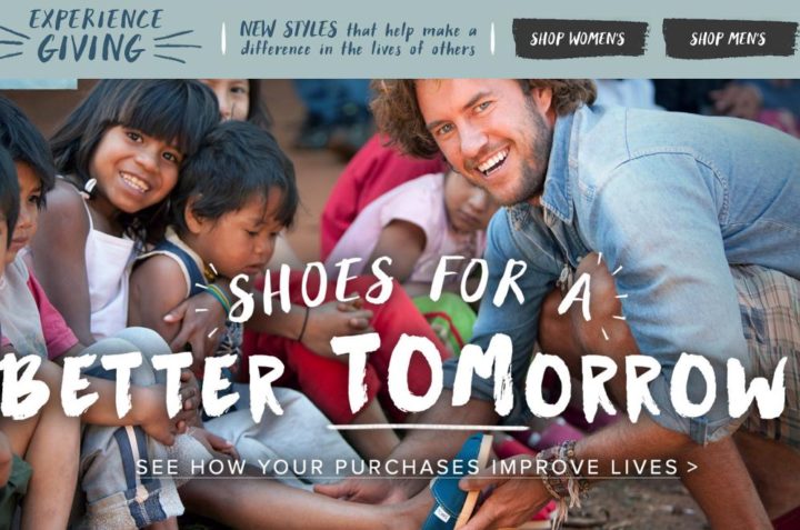
Tom’s Shoes is an e-commerce business with a one-for-one charitable model. For every pair purchased, the company donates a pair to a needy child. The site is filled with unique photos that engage readers to navigate around. The more they stay, the more they are tempted to buy and do good at the same time.
At the same time, illustrations can be quite engaging too.
As attention spans get shorter, and as businesses become increasingly more competitive, many see far more customization as a way to attract and keep visitors on their sites. Moreover, there will be an increasing trend to change out visuals more often, in order to maintain interest.
Video and Animation
The trend toward using more video and moving parts began several years ago, but it will continue to be a key factor in website design through 2017 too. Again, people do not want to read – they want to see. Explainer and ‘how-to” videos will appear right on the site itself, not via a link which takes people away from the site.
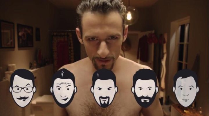
Dollar Shave Club’s homepage is a perfect example of an explainer video that entertains as well as presents an important message about the value of its subscription razor club.
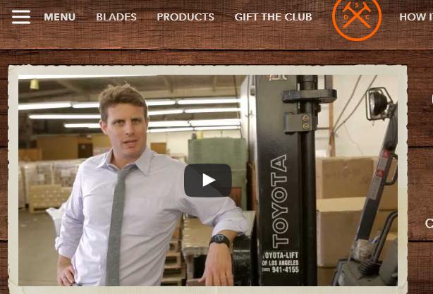
Explainer Videos should be no longer than 60-90 seconds; how-to videos, of course, may be longer. It should be mentioned that this video cost $2,500 to make, it went viral, and the owner is a pretty wealthy man today.
Parallax Scrolling
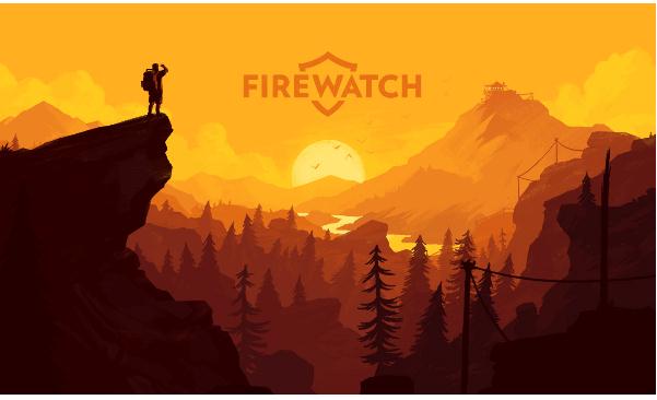
Parallax scrolling occurs when different elements move at different speeds, usually background and foreground. This can be mesmerizing and very cool if not overdone. It will give a page more depth. The example above is for the site for the game “Firewatch.” There are actually six moving layers of trees, but the rest of the site is static so the viewer can read the text. Parallax is around to stay for 2017 though it does present challenges – load time is slower and it does not do well on mobile. Someone will figure out these “bugs.”
Mobile First Designs
It was inevitable a few years ago, that designers would adopt this strategy. Given that there are over 1 billion mobile users on this planet, it makes sense to design for mobile and then integrate the design for PCs.
Death to Splash Pages
These pages pop up to “welcome” a visitor and that must be closed out before the page is fully visible. They are dying a slow death, primarily because they have such high bounce rates and thus impact SEO, not to mention conversions. Visitors find them irritating. Here is the current splash page for PetSmart:
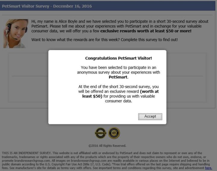
The irritating thing about this page is that a visitor is given no way out of this page without clicking “accept.” And the really irritating thing is that the rewards have nothing to do with pet products. There is simply a long list of “come-on’s” for unrelated products. Shame on you, PetSmart.
Single Page vs. Multi-Page
Single page sites have been quite popular, especially because of mobile device use. It is just easier for users to scroll down or side-to-side than to tap fat fingers on buttons. Making things simple for users was the goal. However, SEO suffers appear as a result. Multiple pages do better with organic searches. Therefore, there is a reversal of the single-page trend.
Text – Time to Get Truly Creative
The sites that are getting visitors to stop and read text and content are those that have amazing headlines, clever product descriptions, and creative, engaging content. Web designers and copywriters who struggle with these things may be better off finding a writing service that specializes in offering creative copywriting. Checking out the best sites for writing help might be a good idea.
Navigation Icons
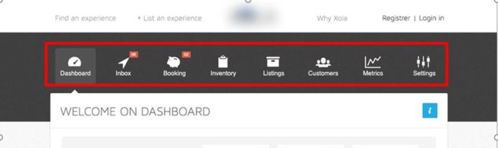
Designers have played around with navigational links for years – placing them on the side, at the top, in drop-down menus and, most recently hamburger menus. One trend that is popping up a bit is the use of icons for navigation, rather than text. This could add visual pleasure to users, but the challenge will be making these icons really intuitive so that a visitor knows exactly what they mean. Here is an example, but note that the text has been included, at least for the time being.
Flat and Minimalistic
The trend has been for minimalistic designs with lots of white space, and that will probably continue. Sleekness and simpleness seem to continue to be appealing to users who do not want to be confused by too many things, especially if there are video and animations.
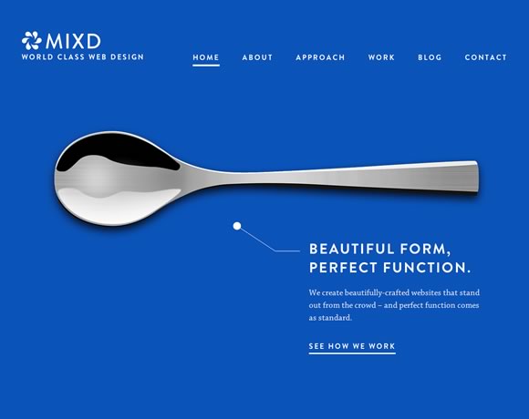
Notice the great contrast effect of the black/white/gray of the spoon. In this case, of course, the “white space” is blue, but it is a captivating landing page.
Responsive Design
I have already covered “mobile first” design strategy, but new technology always has something more to give. How about pages that automatically adjust to different device sizes? But wait – there is more. Designers can now create adaptable pages that will adjust content and visuals for different demographics (e.g., age groups) if that information is requested and received by the site. Elements that are adaptive include menus, colors, fonts, etc
Stories
We know how important stories are for content. It can also be pretty compelling and engaging when used on a landing page. Here is an example of an interactive video by Phillips Razors. The visitor selects a picture to complete a story:
Stories have traditionally been contained in the “About Us” and can be a bit boring if not told creatively and with visuals. But stories can capture audience attention in other ways too. Storytelling will continue to be important in 2017, and the more creative the better the UX will be.
Tactile-Kinesthetic Technology – Haptic Feedback
The technology has been around for a few years, but it has not been used much in website design. The concept is to give a user a tactile cue as he hovers over a button, for example, a saying like “Add to cart,” to stimulate a response. These are usually in the form of a subtle vibration or pulsing. This is quite new, but it will be something to watch next year.
Creativity and Technology Never Sleep
These are trends that many see right now. It is important to be aware. However, developers and the designers that are creative are always experimenting with new UX and UI elements. It is a competitive profession and it will be important to stay on top of new developments.