10 Cleverly Designed 404 Error Pages


‘Sorry the link you requested was not found’ we all know that no user likes seeing this message on their computer screen. An error page results in two cases when either the page has been removed or moved and the URL was not updated or the user has typed incorrect URL. Well, whatever is the case, you can make your website’s downtime less frustrating by turning it into an exciting page that communicates effectively and helps you in directing visitors back to your home page. By turning your 404 error page into something fun, memorable and interactive experience helps you in decreasing your bounce rate while keeping visitors intact.
Here is my list of 10 witty and well-designed 404 page that can surely change the frown into a smile for all your website visitors. Take a look.
1. Bluegg
If laughing is the best form of therapy then you must check Bluegg’s 404 page. This is one of the most cleverly-designed and hilarious 404 page ever. The Page includes an autoplay in the form of an embedded video of a goat that screams in a shrieking sound like a human. This web design and brand design company have infused a great humor in their 404 page that will surely make you laugh.
2. Blue Fountain Media
This New York based digital marketing agency has done some real innovation with their 404 page and let me confess this one is my favorite 404 page. The error page on their website, lets you play the popular fun Pac-Man game inside a giant 404 numerical. Let me tell this one is more fun than the standard Pac-Man level. Bonus, by turning their 404 page into this engaging game, the company has earned additional 50 links.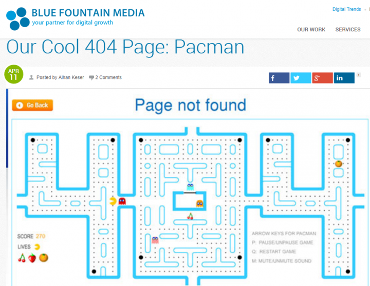
3. Daniel Karcher
Daniel Karcher‘s Film Design Studio has done some great job with their 404 page. They have cleverly-designed their 404 page to resemble a short film by employing a splendid subway station. The page applies some animation, great graphic design and clever references to the television series ‘Lost’. The ticker at the top says ‘Please proceed to the main level’ and when a user clicks on it, is taken back to the homepage. Well, I must say, their 404 page is artsy and elaborate like their work.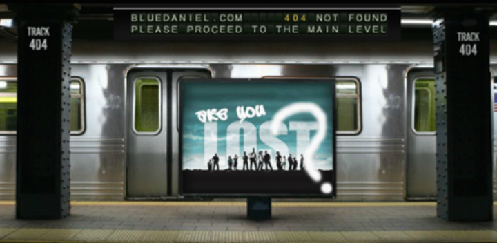
4. CSS-Tricks
Page displays a ripped away website’s wrapping to show what is underneath. The design of their 404 page cleverly fits the rest of their site design and reflects the kind of work company is involved in. The site makes an excellent use of 404 page.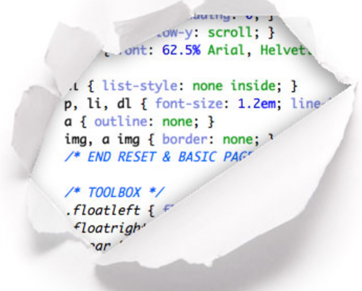
5. Mail Chimp
Next on my list is Mail Chimp, this fabulous email newsletter service company has turned their 404 page into something exciting and endearing. Company’s 404 page has modified their iconic monkey character into a Hulk-like character set against a smoky background- to signify a broken link. The theme of their 404 page is in sync with the design of their website and truly changes the frustrating experience of 404 into more fun.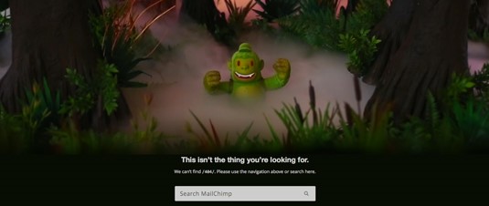
6. Lego
Lego popularly known as the house of bricks has infused same color and creativity into their 404 page as well. Their error page features a cute little tableau holding a broken plug to indicate the error message. This 404 page is an absolute delight for all lego lovers and gives visitors a dose of cuteness.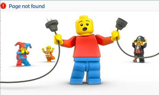
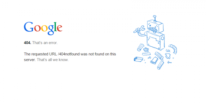
7. Google
Google’s 404 page reflects true simplicity. The page showcases a confused and broken robot to convey the error message. The design of their 404 page goes with the color scheme and theme of Google. Well, this giant search engine never fails to surprise the users. Isn’t it?
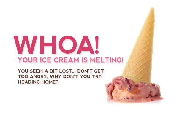
8. CSSscoop
Sometimes it is the lesser known companies that pack the biggest punch, same is the case with CSSscoop. The company has done some brilliant job with their 404 error page. Their 404 error page design is consistent with their brand name and showcases a melting ice cream scoop with the message “Your Ice cream is melting, Why don’t you try heading home? The 404 design they have chosen is pleasing to the eye and goes with the theme of the company.
9. Hot Dot Production
Hot Dot’s error page has done justice to its tagline that says “the intersection of new technologies and design”. The page showcases some brilliant animation featuring 404 numeric made of hundreds of bright red tiny dots that change direction in response to where you move your cursor. Page looks bright and fancy and reflects company’s excellent design capabilities.
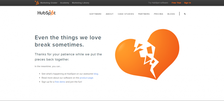
10. Hubspot
Hubspot never ceases to impress us with its creativity. The error page on their website showcases a broken heart with an empathetic message that says “Even the things we love break sometimes”, the message truly captures the essence of broken links and puts it forward in the as lovable way as possible. Not only this, the cleverly-designed page also shares the link to important pages such as a blog, free demo, and product page. Good job guys!
Final Thoughts
This trend is not going to disappear in a puff of smoke so, if you have not embraced this trend yet, you may be losing a good opportunity to re-engage your website visitors. I am sure you have found enough inspiration above, so come up with something creative and end the misery of encountering an error page into something entertaining and engaging. Good luck!