The Best Ideas and Plugins to Make your WordPress Site Perfect for Mobile


More and more people are dependent on smartphones and tablets, and many are using mobile devices to search the web. Hence it is important to have your WordPress sites mobile-ready by assessing the strength of the mobile market so that mobile opportunities will not be left behind.
It is not challenging to have WordPress sites perfect for mobile use. Since most people now do possess a mobile phone, they mostly use the blog or scour through websites on it. The mobile compatible marketing strategy also helps driving traffic to your website since the SEO efforts are geared for all websites too. Mobile device optimization is hence a must for all websites, especially in times of tough competition in the market; marketers are trying to leverage every channel to pull as much traffic as they can.

It is important for website owners to leverage the value of their WordPress websites by generating new traffic even if it means that they resort to mobile app development or use of WordPress plugins, which also work well. Additionally, the site needs to be legible enough with images and optimized for use on different screen sizes. The screen size and resolution matters over time and a low-resolution site on mobile can even cost you, potential customers.
Here are some very useful tips to make your WordPress site perfect for mobile:
1. Use Mobile-Friendly Themes
It is important to have a consistent theme of your website on all platforms. With a good mobile theme, one can have their sites render perfectly on a smartphone. You can develop some mobile-friendly themes or get in-house designers to design themes for you. The boost in mobile device use is directly connected to the best mobile WordPress themes available on the web.
Twenty Fourteen, which is WordPress’ default theme is preferred by many people for their websites. The best part is that it is responsive, and includes several menu configurations that suit diverse screens.
Metro is also a very popular mobile theme that is responsive and attractive. One can even make changes to any theme to convert it into a mobile theme with some CSS tweaks that will render the website perfectly on various mobile screens. Scherzo is also one good minimalist WordPress theme along with
Mayashop. For e-commerce WordPress sites, the Jigoshop plugin works seamlessly with Mayashop, especially since e-stores are challenging to be rendered correctly on mobile devices.
The founders of WordPress itself developed Mobile Theme Module that offers a butt-load of features applicable for different people. This Jetpack module can even override the active theme settings with its Jetpack Mobile theme. Additionally, it supports the best SEO standards and also features code optimization that makes the site look beautiful in a jiffy.
2. Use Plugins
WordPress developers have developed a number of plugins that aid the website owner in availing multiple features in a streamlined manner. All plugins serve different purposes and aid in making the site mobile-friendly too.
As site owners, it is preferable to spend one’s time and effort on business rather than the technical requirements of the website. A simple plugin can aid the site to be mobile-friendly and arrange content systematically on the mobile screens. WordPress Mobile Pack is one plugin that gives administrators control on website’s mobile version. The plugin also renders mobile sites in four different colors and palettes.
WP Mobile Detector is another plugin that can perform mobile site optimization and is compatible for rendering WordPress sites on thousands of smartphones, tablets, and other gadgets. No one has to spend weeks to figure it out.
Any Mobile Theme Switcher is one nifty little plugin that lets site owners load different themes for the mobile platform and desktop platform. The plugin also recognizes different Android and iOS devices along with tablets. One can select different mobile themes for each device without having to do it manually.
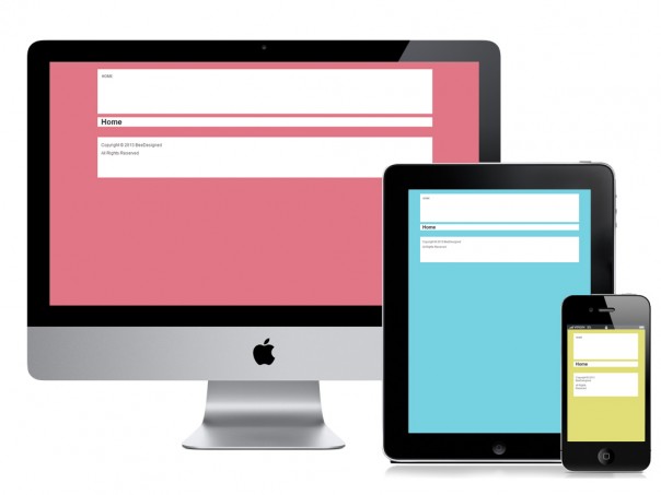
3. Make Your Site Responsive
If you are creating a new WordPress Site, it is important that you opt for a responsive website. With a responsive site, each of the elements gets systematically arranged and organized on mobile automatically. Desktop versions will look different than the sites rendered on mobile platforms.
If the site is viewed on a tablet or laptop, the design sets itself impeccably with the borders of each platform. Having the responsive design for each website means that they are customized for rendering perfectly on all platforms. With a WordPress site, owners can only select the right responsive WordPress theme to suit their brand and website’s style. You can create any sort of responsive layout that you need.
4. Minimize Cluttered Graphics
Gauge a mobile device’s screen, and although they get bigger with every year launches, they are way smaller than other platforms. Hence one should stop filling one’s website with fancy graphics and tidy up the layout. Too much of graphics is definitely a no-no for mobile users since the load time is huge.
All e-commerce sites need to pay heed to this fact. Shoppers do not want graphics to bombard their navigation. Sales happen only if the purchasing process is quick and efficient.
5. Choose Text Wisely
After minimizing graphics, get a workaround to minimize text too. Visitors do not have too much time to read through all their screens to know more about a product. Hence too much text might put off buyers who are not likely to zoom in and out. Give a concise and precise description for each product on the WordPress e-commerce site, and that will do.
Sellers can get attention to their products with a minimalist feel and uncluttered layout in both text and graphics. Give shoppers what they need to make the purchases.
Conclusion
Optimizing WordPress sites for mobile is not complicated, but it is vital for all business owners to have a site compatible as soon as possible. As a savvy online entrepreneur, you know that the mobile world is taking over and you have to play according to the rules only, for larger success.